The FramePond field guide · 12 examples

AI YouTube thumbnail prompts: 12 visual examples

A useful thumbnail makes one idea visible before the viewer reads the video title. These examples explore different ways to do that: a face beside a result, a product comparison, a dramatic scene or a short, oversized headline.

Explore the examples
A smiling presenter points to a laptop beside a website headline and a timer.
AI-generated visual example · View prompt details

01 / The brief

Build a brief you can use

Choose a composition from the gallery, then build it around the actual video. The examples are AI-generated references, not evidence of higher click-through rates; the original starter below is a separate exercise. FramePond supports text and reference images. To preserve your own face or an exact product, upload a clear reference and check the result, or combine the background with your real cutout in an editor.

01

Choose one thing the video delivers

Write a plain sentence describing what the viewer will learn or see. For a tutorial, show the completed result; for a review, choose one product and one useful contrast. Pick the main visual before the headline. A thumbnail about building a website should show the site or its creator, not an unrelated dramatic scene.

02

Try a reusable background brief

Original starter: “Create a wide 16:9 illustration for a video about organizing a small desk. Place a compact desk with a clearly arranged laptop and lamp on the right. Leave the left third calm and dark for a short headline. Warm side light, simple shapes, strong subject separation, no people, logos or text.” Replace the task and main object; add an accurate headline afterward.

03

Separate likeness and lettering

For a creator-led thumbnail, use a photo you own as a cutout or provide it to a reference-capable image editor. Leave clear space around the eyes and face. Add exact headlines and product screens in an editor so you can control spelling and scale. In FramePond, add your photo as a reference and check that the result preserves your likeness.

04

Check the composition at feed size

Resize a copy to roughly 320 pixels wide as a quick legibility check, not an upload specification. Can you recognize the subject and read the main words immediately? If not, enlarge the subject, shorten the headline or remove a competing object. Keep important content away from the lower-right area where the player’s duration label may sit.

05

Compare two clear alternatives

Create one version showing the outcome and another showing the process. Keep the title, subject scale and color treatment comparable so you can describe what changed, and save each version with a meaningful name so later results can be matched to it.

06

Fix the specific weak point

If the image feels crowded, remove secondary icons before adding contrast. If text is hard to read, place it over a calm area and inspect the small preview again. For a portrait or square reference, rebuild a wide layout instead of stretching it. Finally, view the thumbnail beside the video title and remove any claim the video does not deliver.


From the examples to your own image

Should the thumbnail show a result or a reaction?

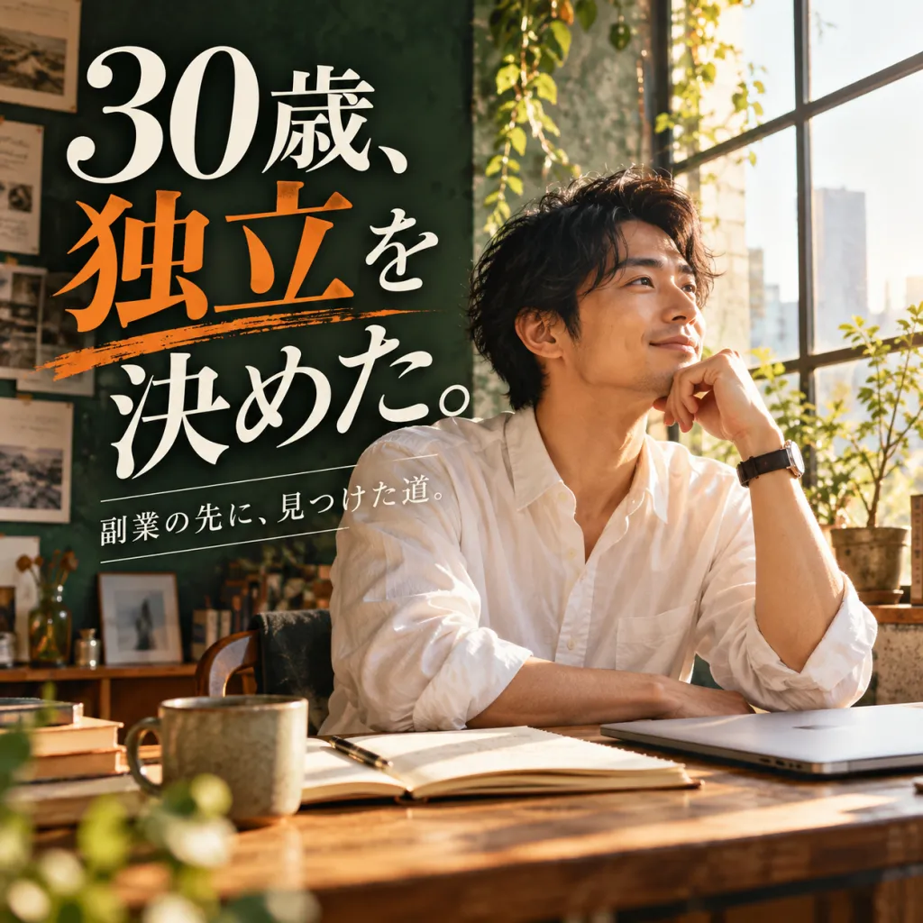
For a tutorial, the website example makes the finished screen part of the promise. Start with that direction when viewers need to see what they will make. For a review, the phone example uses a face and a green/red comparison to frame a verdict. A reaction alone does not show what was tested: keep the actual product prominent and replace the generated screen with your own evidence. Choose the visual that explains this video, then write the headline to add context.

Tutorial: show the finished result Review: create a clear comparison

Can a portrait or square image become a wide thumbnail?

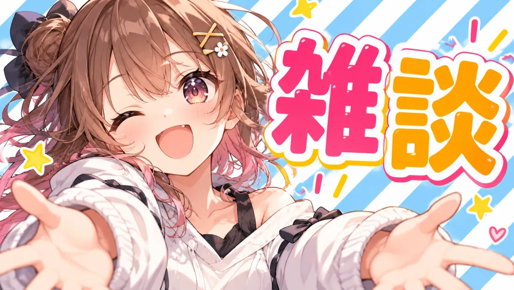
The cafe portrait places tall lettering beside the person; the kitten image stacks several lines across a square frame. Stretching either to 16:9 distorts the subject, while cropping can remove the face or headline. Rebuild the layout with the subject on one side and a short headline on the other. In a reference-capable editor, extend the background while retaining your own subject, then set exact text separately. Check the new composition at a small size before choosing it.

Personal milestone: portrait and headline How-to: playful type and one subject

What should change between two thumbnail drafts?

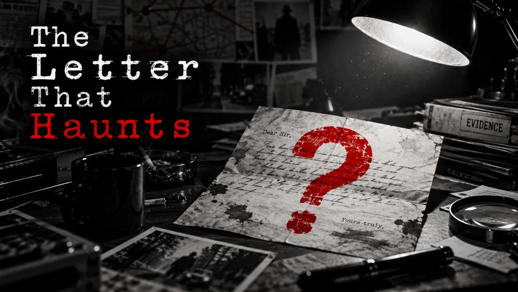
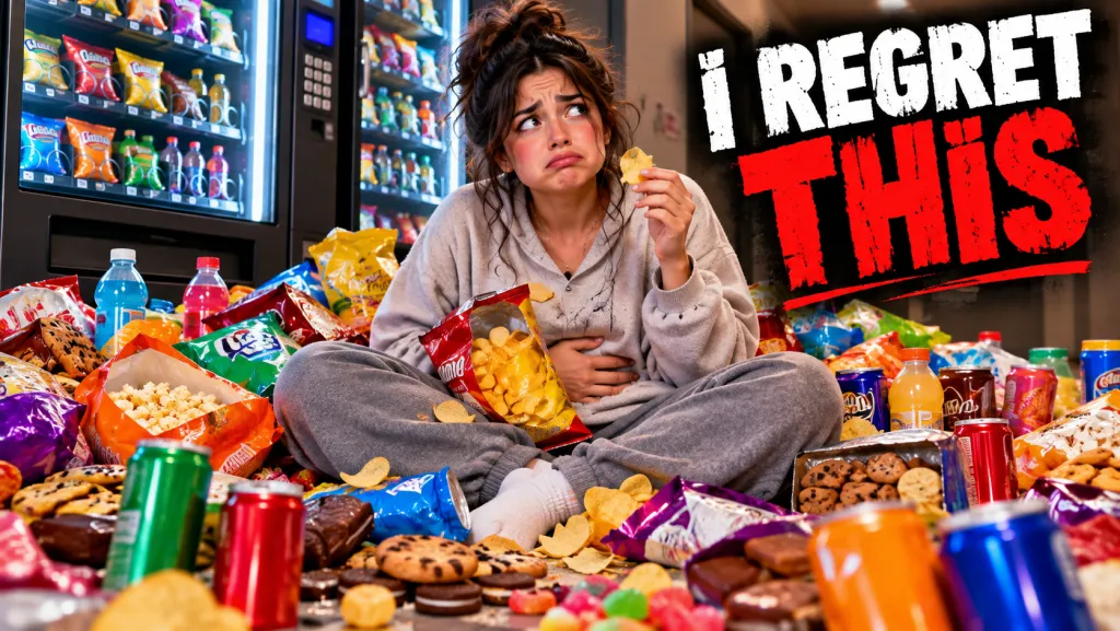
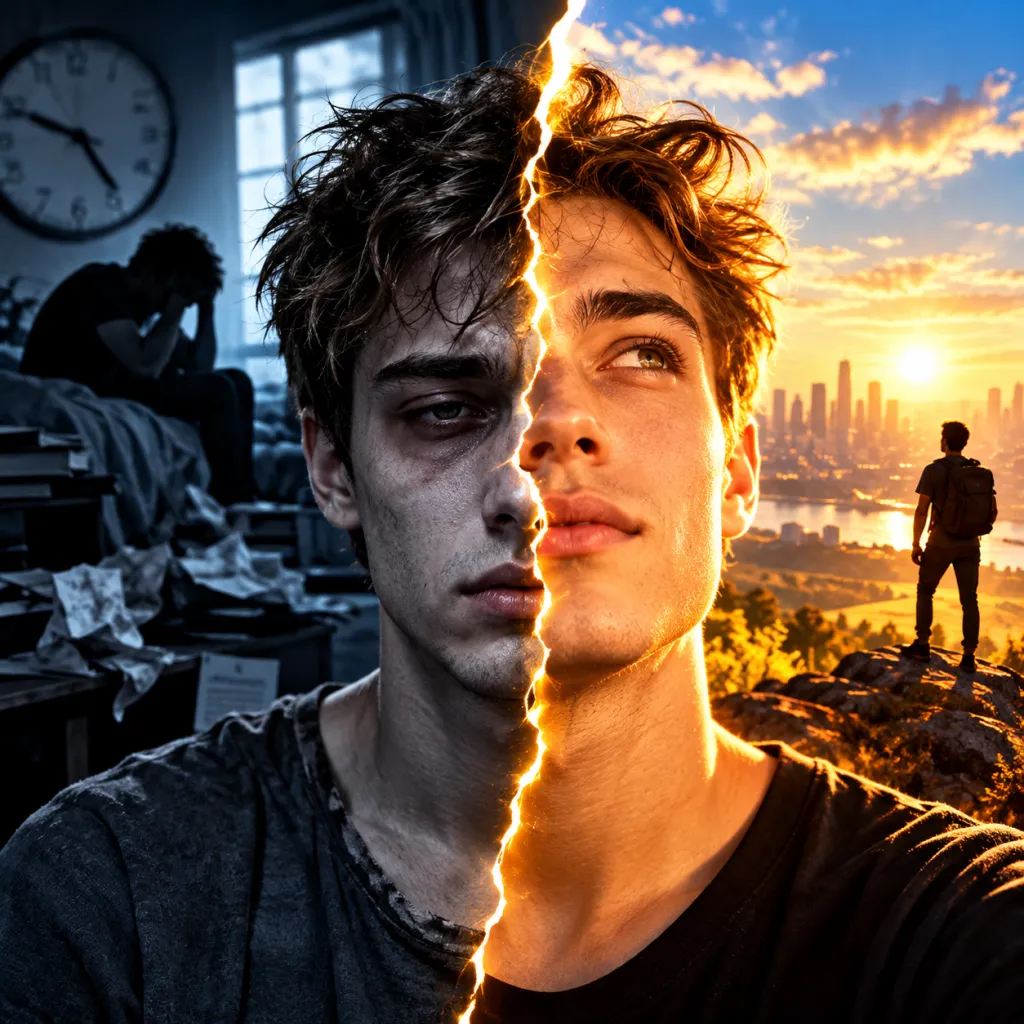
Hold the video title and core subject constant. Make version A show the outcome and version B show one meaningful obstacle, using a similar headline length and subject size. The letter example isolates a single prop, while the snack scene pairs an expression with a busy setting. Use comparable audience data from your actual video to assess drafts.

Mystery: one unanswered question Personal story: face and consequence

03 / Before you publish

Give the result a final check

Put the final thumbnail beside its video title at a small display size. The two should work together: use the image for the scene or result and the title for useful context. Remove tiny captions that only become readable when enlarged.

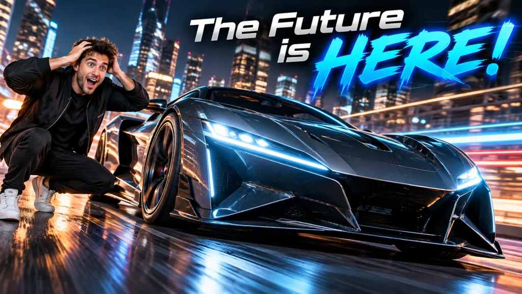
Check the actual face, product screen, logos and headline spelling. AI-generated people and concept products should not imply a real endorsement or a review of hardware you did not test.

Keep a record of which version was published and when. Evaluate it with the video’s actual audience and performance data; the gallery supplies composition ideas, not a promised click-through improvement.

Build your YouTube thumbnail

Draft your thumbnail background directly in the generator using your own prompt or an unlocked concept. Attach creator portraits or object references to preserve visual continuity, generate in 16:9, and verify small-preview clarity and subject separation before downloading. Add exact channel titles separately in your layout editor.

Create thumbnailSet up Agent →Browse the full category →Compare Free and Pro

Report this prompt

Find reporting details on our contact page and include this prompt’s page address.